Tache de Beauté
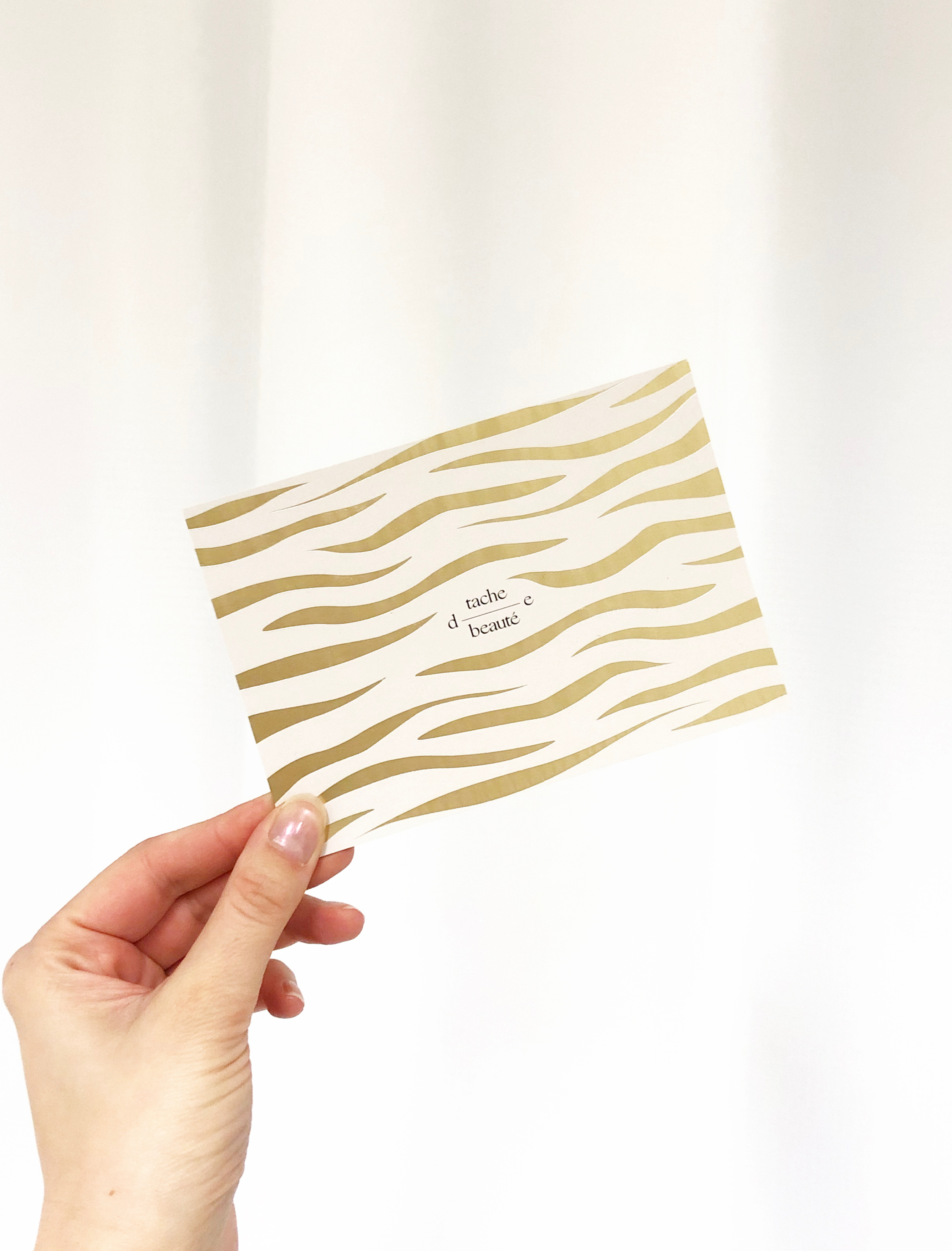
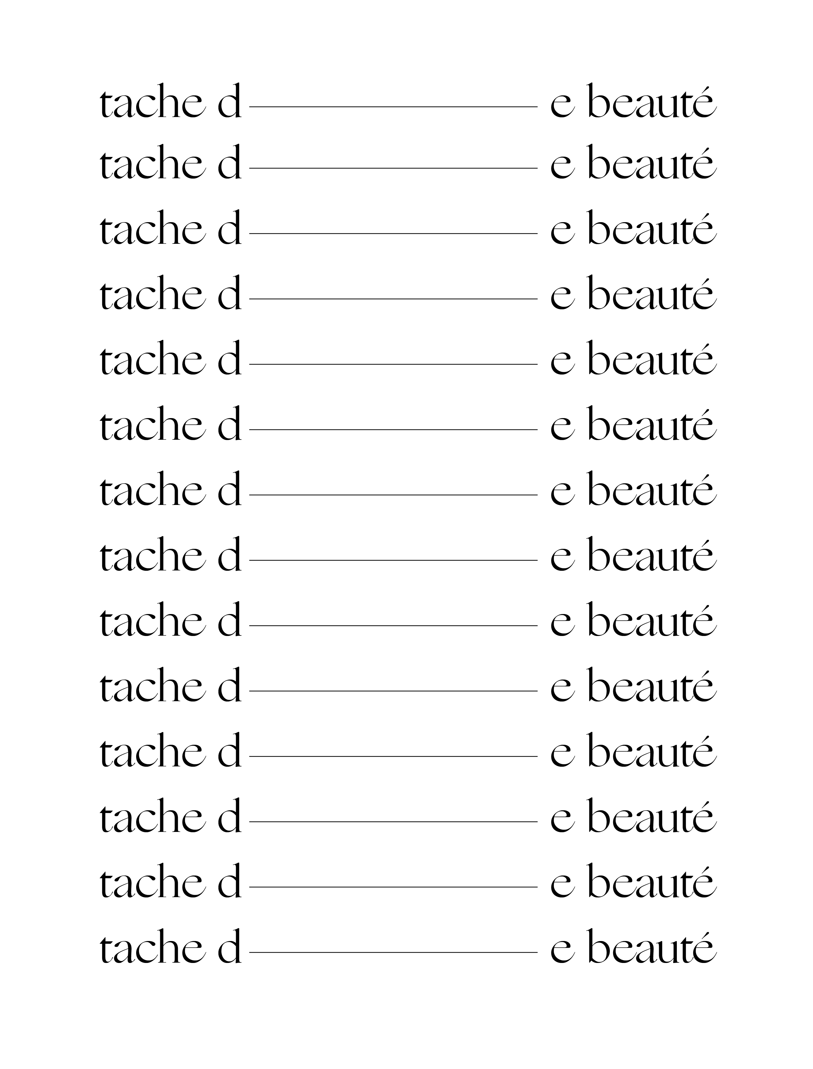
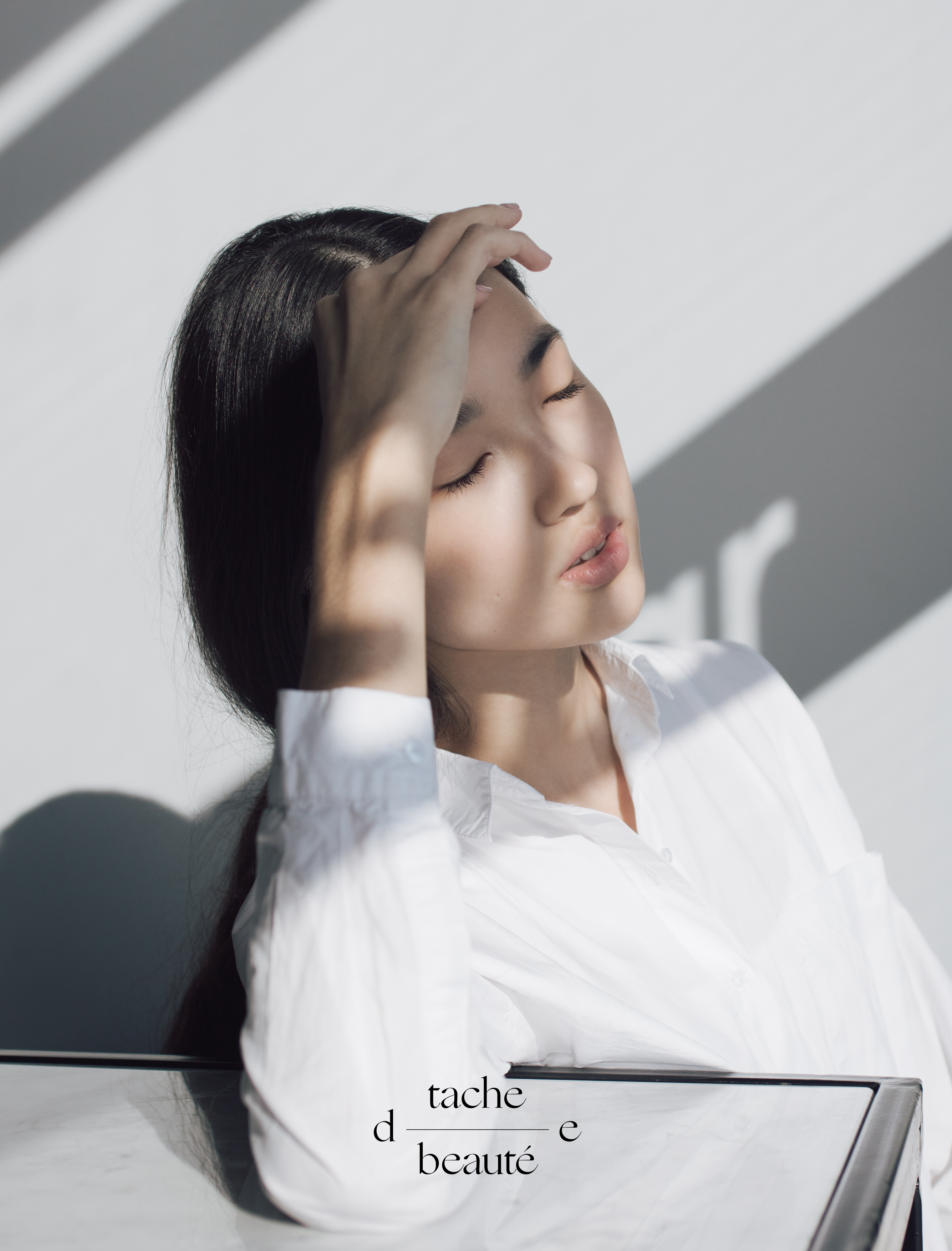
Tache de beauté is a beauty salon in Belgium run by Chantal. She was in need of a strong rebrand that suited her clients. Her salon is a safe haven for beauty treatments.Starting out we searched for the right font to match her personal style. Ogg Roman, an elegant and refined font, was the right fit. We designed two logotypes that were able to transform according to their use. One horizontal one and one compact logo. To accompany the logo we designed a waving pattern that resembles the curves of a human body. The color palette is formed by light grey - a soft and soothing tone - and gold - a bright and powerful luxurious color. Together they create the perfect balance. Web development by So-uncalled-For.
What did we design?
- Identity design
- Postcard design
- Pattern design
- Giftcard design
- Appointment card
- Instagram design
Would you like to work with us?